US Treasury 1M-30Y curve + key spreads + regime classifier.
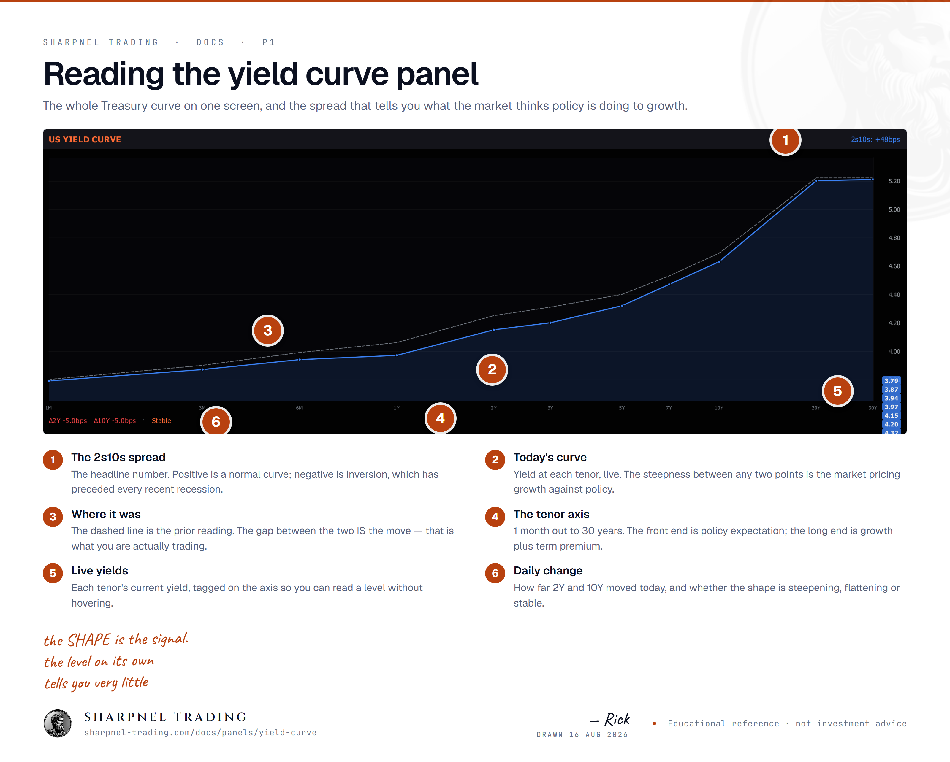
The whole US curve from 1M to 30Y with the key spreads and a regime classifier. Read the shape before any single tenor — a move that only looks big on its own chart usually is not.
Reach for itAny session where rates are driving, which is more of them than people assume.
“The yield curve plots government bond yields across maturities, a watched read on rate expectations.”
US Treasury 1M-30Y curve + key spreads + regime classifier.
Open itAdd Panel ▸ Macro ▸ Rates & Curve ▸ Yield Curve (UST 1M..30Y)
1-month through 30-year Treasury yields plotted in tenor order. A normal curve slopes up (longer = higher yield); inverted = recession signal historically.
2s10s, 3m10y, 5s30s — the spreads that matter for cycle reads. 3m10y is the New York Fed's preferred recession-probability input. Inversion + widening at the front-end = market expects cuts.
Current curve shape bucketed: STEEPENING / FLATTENING / INVERTED / NORMAL. A regime change is one of the highest-conviction macro signals; the chip tracks it real-time.
Inversion + widening credit spreads = late-cycle recession signal. Inversion + tight credit + funding stress = stagflation risk. Inversion alone = front-end cuts coming.
