N×N symbol correlation grid + diversification register.
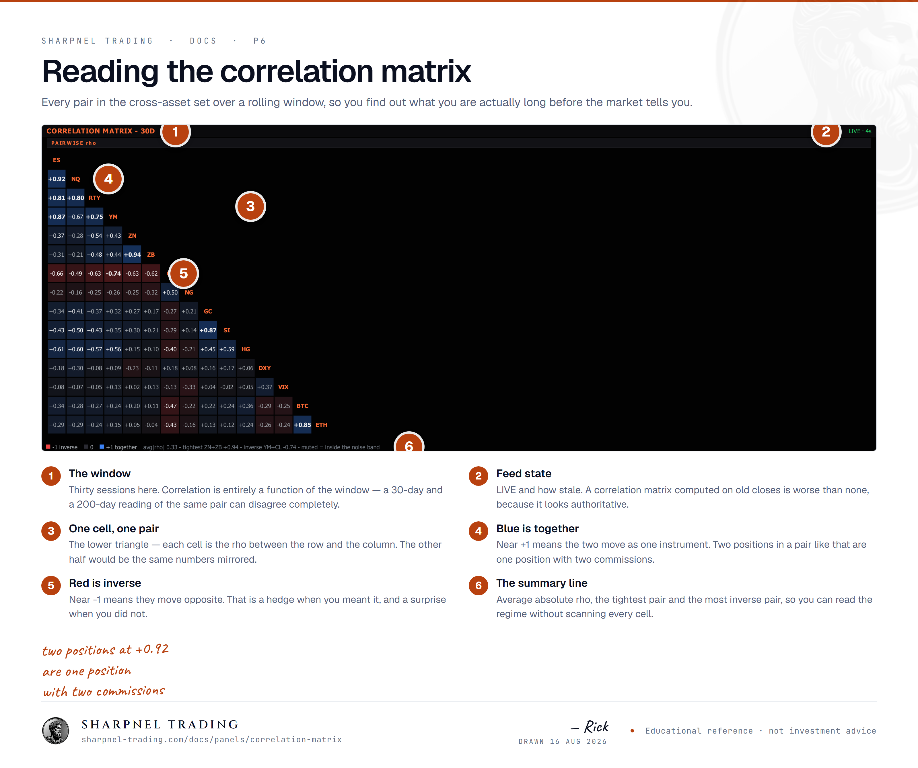
An N×N grid of how your symbols actually move together, with a diversification register beside it. This is the panel that tells you six positions are really one position wearing a costume.
Reach for itAny time the book feels diversified. That feeling is what this checks.
“The correlation panel shows how closely instruments have moved together over a chosen window.”
N×N symbol correlation grid + diversification register.
Open itAdd Panel ▸ Macro ▸ Equities & Breadth ▸ Correlation Matrix (N×N heatmap)
Each cell = Pearson correlation between two symbols over the rolling window. Diagonal trivially 1.0. Bright green = highly correlated (+1.0). Bright red = anti-correlated (-1.0). Grey = uncorrelated.
Top-right chip: HEAVILY CORRELATED / DIVERSIFIED / ANTI-DIVERSIFIED. Calculated from the average absolute off-diagonal correlation. Crisis regime collapses everything to +1.0 — diversification fails when you need it.
Bottom strip: the strongest positive pair (most redundant pair in your portfolio) + strongest negative pair (best hedge candidate). Drop the redundant; pair the hedge.
When correlations jump from ~0.3 to ~0.8 over a week, the market regime has shifted to systematic-risk-driven from idiosyncratic. Reduce gross; flatten directional bets; widen stops.
